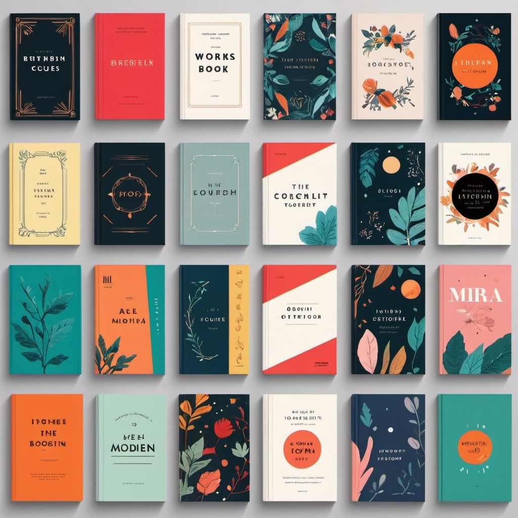
Typography is a crucial aspect of book cover design, as it plays a significant role in conveying the tone, genre, and mood of the book. A well-designed typographic element can make a book cover stand out, while a poorly designed one can detract from the overall design. Here are some reasons why typography is important in book cover design:
- Conveys the Genre: Typography can help to convey the genre of the book, making it easier for readers to identify the type of book it is. For example, a bold, sans-serif font might be used for a sci-fi or thriller novel, while a more elegant, serif font might be used for a literary fiction novel.
- Sets the Tone: Typography can also help to set the tone of the book. For example, a playful, cursive font might be used for a humorous novel, while a bold, sans-serif font might be used for a more serious or dramatic novel.
- Creates Visual Interest: A well-designed typographic element can create visual interest and draw the reader’s attention to the title or author name. This can be especially important for books that have a lot of competition in the market.
- Adds Emotional Connection: Typography can also help to create an emotional connection with the reader. For example, a font with a sense of nostalgia or warmth might be used for a memoir or historical novel, while a font with a sense of energy or excitement might be used for an action-packed thriller.
- Consistency: Consistency is key when it comes to typography. Using a consistent font style and size throughout the design can help to create a cohesive look and make the book cover more visually appealing.
- Legibility: Finally, typography is important because it affects the legibility of the text. A font that is difficult to read can detract from the overall design and make it harder for readers to find and identify the book.
Tips for Choosing Typography:
- Choose Fonts Wisely: Choose fonts that are relevant to the genre and tone of the book.
- Experiment with Different Fonts: Experiment with different fonts to find the one that works best for your book.
- Use Fonts Consistently: Use fonts consistently throughout the design to create a cohesive look.
- Consider Legibility: Consider the legibility of the font when choosing a typeface.
- Use Font Sizes Effectively: Use font sizes effectively to create visual hierarchy and draw attention to important elements.
- Add Textures and Effects: Add textures and effects to your typography to create visual interest and make it stand out.
Some popular typography styles for book covers include:
- Sans-serif fonts (e.g. Arial, Helvetica)
- Serif fonts (e.g. Times New Roman, Garamond)
- Script fonts (e.g. Lobster, Pacifico)
- Display fonts (e.g. Museo, Playfair Display)
Ultimately, the key to choosing effective typography is to experiment with different fonts and styles until you find one that works well with your book’s genre, tone, and overall design.