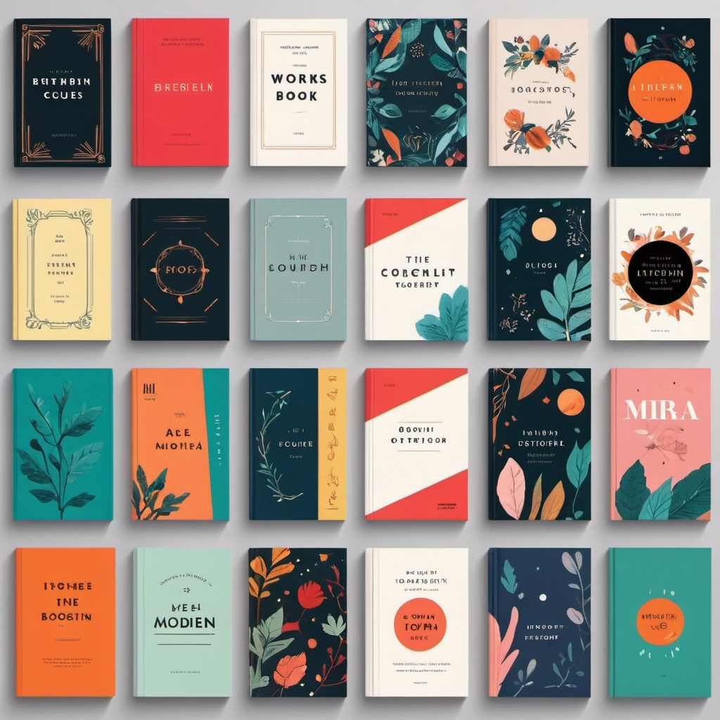
Color theory is a crucial aspect of book cover design, as it can greatly impact the visual appeal and effectiveness of your design. Here are some key principles of color theory that can help you create a stunning book cover:
The Color Wheel:
The color wheel is a circular diagram that shows how colors are related to each other. It’s divided into primary colors (red, yellow, and blue), secondary colors (orange, green, and purple), and tertiary colors (colors created by mixing primary and secondary colors).
Color Harmony:
Color harmony refers to the way colors work together to create a visually appealing design. There are several principles of color harmony:
- Monochromatic: Using different shades of the same color to create a cohesive look.
- Complementary: Pairing colors that are opposite each other on the color wheel (e.g., blue and orange).
- Analogous: Using colors that are next to each other on the color wheel (e.g., blue, green, and yellow).
- Triadic: Using three colors that are equally spaced from each other on the color wheel (e.g., blue, yellow, and red).
Color Psychology:
Color psychology is the study of how colors can evoke emotions and moods in people. Different colors can be associated with different emotions, such as:
- Red: Energy, passion, excitement
- Orange: Warmth, enthusiasm, creativity
- Yellow: Happiness, optimism, sunshine
- Green: Nature, balance, harmony
- Blue: Calmness, trust, professionalism
- Purple: Luxury, creativity, wisdom
Using Color Theory in Book Cover Design:
Here are some tips for using color theory in book cover design:
- Choose a dominant color: Select a color that will dominate the design and use it as the background or main element.
- Use contrast effectively: Use contrasting colors to make text or images stand out.
- Consider the mood and tone: Use colors that evoke the mood and tone of your book.
- Be mindful of cultural associations: Avoid using colors that may have negative associations in certain cultures.
- Use white space effectively: Use white space to create a clean and uncluttered design.
Examples of Color Theory in Book Covers:
- The Hunger Games: The use of red and black creates a sense of danger and rebellion.
- The Girl with the Dragon Tattoo: The use of dark blues and grays creates a sense of mystery and intrigue.
- The Harry Potter series: The use of bright reds and golds creates a sense of magic and wonder.
- The Lord of the Rings series: The use of earth tones creates a sense of adventure and epic scope.
By applying these principles of color theory, you can create a book cover that effectively communicates the tone and mood of your book, while also attracting readers’ attention.

